One of the courses I’m taking in my first year at ASU is a course called Media Design Applications. This course is centered around the use of various media design techniques in specific relation to their application in a theatrical setting. One of the techniques that we discussed in class is architectural projection mapping. This form has quickly become popular for forcing perspective, and opportunity for complex illusion. The underling principal of projection mapping is to highlight and take advantage of physical from in order to create the illusion that the entire surface is, itself, a screen. There are a variety of techniques to achieve this illusion, some based entirely in software and others based in the process of generating the artwork itself. This is an essential and powerful tool for the media designer as it opens up a wide range of possibilities for the creation of theatrical illusion. Before I start to talk about the process, here’s the project description:
Project Description:
Component 2 – Geometry, Surface and Illusion
Unfortunately - or possibly fortunately - media designers in the theatre get a nice, rectangular, white screen to shoot at from a perpendicular, on-center angle. In this section, we will explore methods for dealing with odd angles, weird shapes, and non-ideal surfaces, as well as exploring special effects that are possible through the right marriage of projection, surface and angle. For this project, you may choose a building, sculpture or other built object in the ASU environment, then map its geometry using the techniques shown in class and create content utilizing that geometry to best effect. Final presentations of this project will be in the evening on campus.
I started by this process by first scouting a location. After wandering around campus several times I one of the buildings that I kept coming back to was a energy solutions building by a company called NRG. One of the larger draws of this building happens to be the location. Positioned directly across from one of the campus dormitories it seemed like an ideal location that would have a built-in audience. While there’s no guarantee that there will be many students left on campus at this point, it never hurts to plan for the best.

The face of the building that points towards the dormitories is comprised of abstract raised polygons arranged in narrow panels. These panels come in two varieties creating a geometric and modern look for the building. One of the productions I’m working on next year has several design elements that are grounded in abstract geometric worlds, and this seemed like a prime opportunity to continue exploring what kind of animation works well in this idiom.
Project Description:
Component 2 – Geometry, Surface and Illusion
Unfortunately - or possibly fortunately - media designers in the theatre get a nice, rectangular, white screen to shoot at from a perpendicular, on-center angle. In this section, we will explore methods for dealing with odd angles, weird shapes, and non-ideal surfaces, as well as exploring special effects that are possible through the right marriage of projection, surface and angle. For this project, you may choose a building, sculpture or other built object in the ASU environment, then map its geometry using the techniques shown in class and create content utilizing that geometry to best effect. Final presentations of this project will be in the evening on campus.
I started by this process by first scouting a location. After wandering around campus several times I one of the buildings that I kept coming back to was a energy solutions building by a company called NRG. One of the larger draws of this building happens to be the location. Positioned directly across from one of the campus dormitories it seemed like an ideal location that would have a built-in audience. While there’s no guarantee that there will be many students left on campus at this point, it never hurts to plan for the best.
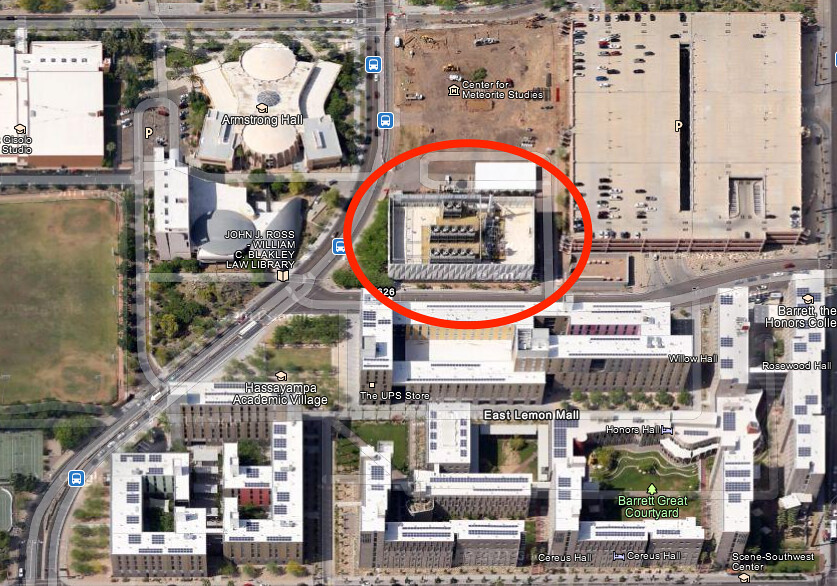
The face of the building that points towards the dormitories is comprised of abstract raised polygons arranged in narrow panels. These panels come in two varieties creating a geometric and modern look for the building. One of the productions I’m working on next year has several design elements that are grounded in abstract geometric worlds, and this seemed like a prime opportunity to continue exploring what kind of animation works well in this idiom.

In the Asset or In the System
The debate that is often central to this kind of work is centered around an approach that values building a system (or program) for creating the aesthetic, or to instead create the work as fixed media artifacts. In other words, do you build a something that is at it's core flexible and extendable (though problematic, finicky, and unabashedly high maintenance) or do you build something rigid and fixed (though highly reliable, hardware independent, and reproducible)? Different artists prefer different methods, and there are many who argue that one is obviously better than the other. The truth of the matter, however, is that in most cases the right approach is really a function of multiple parameters: who's the client, what's the venue, what's the production schedule, what resources are available, is the project interactive, and so on. The theoretical debate here is truly interesting, and in some sense calls into question what the skill set is most appropriate for the artist who intends on pursuing this practice. The print analogy might be, do you focus on designing within the limitations of the tools that you have or do you commit to building a better printing press so that you can realize the design exists only as an abstract thought?
Recent Arizona State MFA graduate Boyd Branch shared these thoughts about this very topic:
I don't know if there is much of a debate between system building and design for production. Quite simply- every production demands aesthetics. The aesthetic is always the most important. The system is only useful in as much as it generates the appropriate aesthetic experience. It doesn't matter how reliable, interesting, or functional a system is if it isn't supplying an aesthetic relevant to production. A "flexible and extendable " system is only useful if the aesthetic of flexibility and extendibility is ostensibly the the most relevant aesthetic. Interactivity is an aesthetic choice for performance and only relevant when ontology or autonomy are the dramatic themes. For theatre in particular, the system inevitably becomes a character, and unless that character is well defined dramatically, it has no business inserting itself into production.
The debate if any is internal for the designer and presented as a range of options for the producer/director. That debate is a negotiation between time and resources. A designer may be able to envision a system that can achieve an effect- but without sufficient experience with that system and the ability to provide a significant degree of reliability, such a system should not be proposed without articulating how the dramatic themes will inevitably shift to questions about technology.
Sometimes an aesthetic is demanded that requires experimentation on the part of the designer. A designer has to be knowledgable enough about their skill set to know how to explain the cost involved in achieving that aesthetic. And if that cost is reliability than it is incumbent on the designer to iterate that cost and explain how the production will hinge on the unpredictability of that system.
An unreliable system , however, is frankly rarely good for any production unless unreliability is the theme. If a production requires a particular aesthetic experience that seems to be only achievable with the creation of a new tool, then it must be recognized that that tool and the presence of that tool embody the major dramatic themes of production.
Avant garde theatre is one of the best environments for exploring the aesthetics of system building - but it is also the theatre that has the smallest budgets...
For this particular assignment we were charged with the approach of building everything in the asset itself. That is, building a fixed piece of video artwork that could then be deformed and adjusted with playback software (MadMapper).
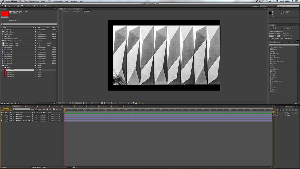
Given the nature of this assignment it made sense that Adobe After Effects would be the tool of choice. AE is an essential tool for any media designer, especially as there are times when pre-rendered media is simply the best place to start. I spent a lot of time thinking about the direction that I wanted to move in terms of overall aesthetic for this particular assignment, and I found that again I was thinking about abstract geometric worlds, and the use of lighting in 3D environments in order to explore some of those ideas. As I've been thinking about the production I'm working on the in the fall it's seemed increasingly important to take advantage of open ended assignments in order to explore the ideas and directions that feel right for that show. I'm really beginning to see that the cornerstone of successful independent learning comes from deliberate planning - what can I explore now that will help me on the next project? To that end, what kind of work do I want to be making in two years, and how can I set myself to be successful? Planning and scheduling may be one of the most under-stressed skills of any professional, and I certainly think that applies to artists.
In thinking about abstract animation with After Effects I knew that I wanted to explore four different visual worlds: flat abstract art, lines and movement, 3D lighting and the illusion of perspective, and glitch art. Each of these has it's own appeal, and each also has a place in the work that I'm thinking about for the fall.

Worlds Apart
Flat and abstract
In thinking about making flat abstract art I started, as I typically do, by doing lots of visual research. One of the more interesting effects that I stumbled on was achieved by using AE's radio waves plug-in in conjunction with a keyframed mask. YouTube user MotionDesignCommun has a great tutorial about how to achieve these particular visual effect. Overall the media takes on a smoke-like morphing kind of look that's both captivating and graceful. A quick warning about this effect. This is definitely a render hog. The 30 seconds of this effect used for this project took nearly 7 hours to render. As a disclaimer I did render the video at a projector native 1920 x 1200. All of that aside, this effect was a great way to explore using morphing masks in a way that felt far more organic that I would have originally thought about.
Lines and Flat Movement
I also wanted to play with the traditional big-building projection mapping effect of drawn-in lines and moving shapes. In hindsight I think the effect of the lines drawing in took too long, and ultimately lost some of the visual impact that I was looking for. I also explored playing with transforming shapes here, and that actually was far more interesting and happened too quickly. My approach for this effect was largely centered around the use of masks in AE. Masks, layers, and encapsulated effects were really what drove this particular exploration. Ultimately I think spending more time to write an expression to generate the kind of look that I'm after would be a better use of my time. If I were to go back I think I could successfully craft the write formula to make the process of creating this animation easier, but it really took the effort of creating the first round of animation to help me find that place. One of the hard, but important lessons, that I've learned from programming is that sometimes you simply have to do something the hard way / long way a couple of times so that you really understand the process and procedural steps. Once you have a solid idea of what you're trying to make, it becomes much easier to write the expression as an easier way to achieve the effect you're after.
3D Lighting and the illusion of Perspective
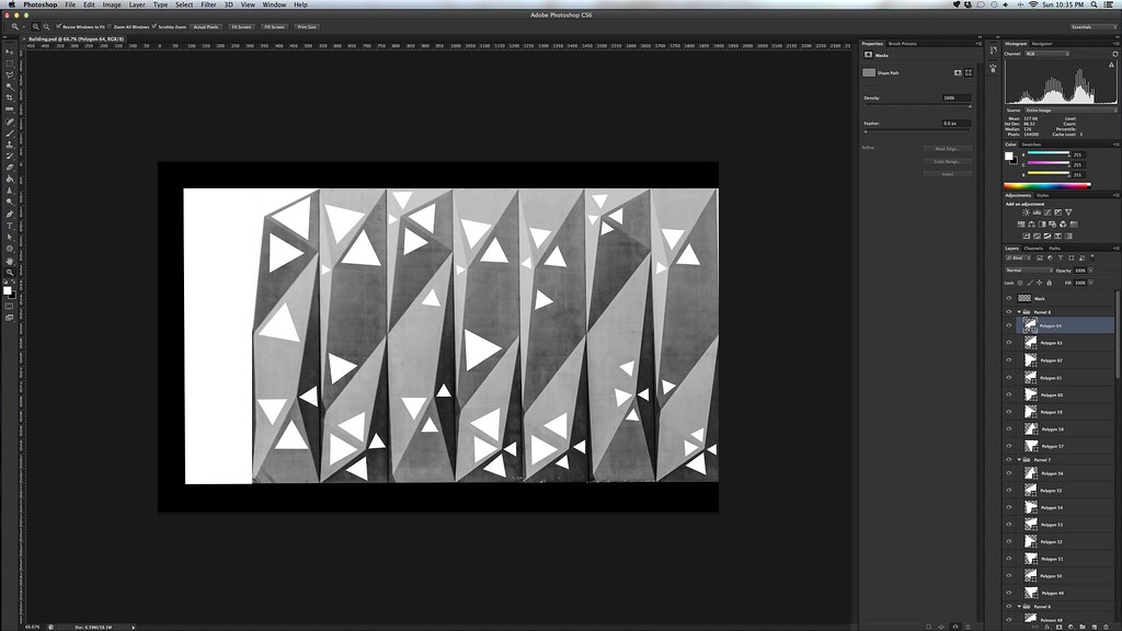
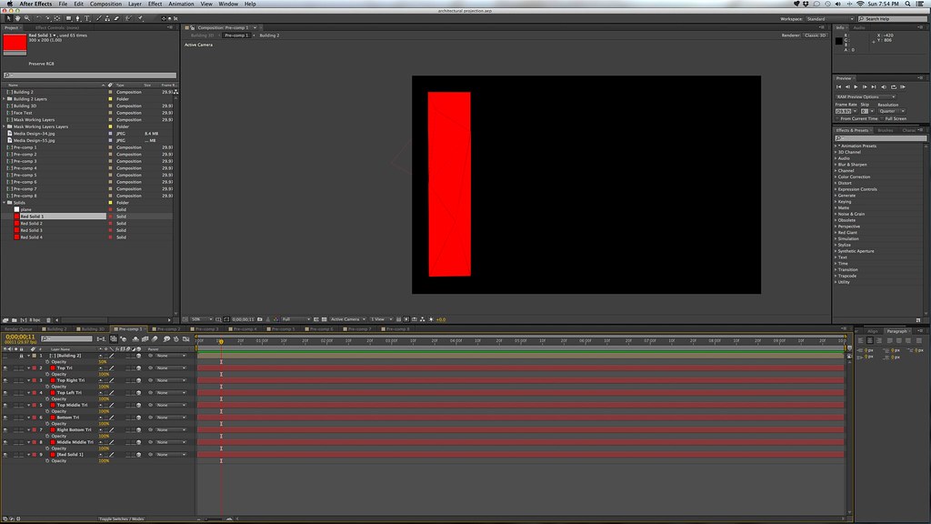
Another projection designer's magic trick that I wanted to play with was the idea of creating perspective with digital lighting of a 3D environment. By replicating the geometry that you're projecting onto, you the designer can create interesting illusions that seem impossible. In my case I started in After Effects by positing planes in 3D space at steep angles, and then masking them so that they appeared to mimic the geometry of the actual building. To make this easier for myself, I worked in a single column at a time. I then pre-composed individual columns so that they could easily be duplicated. The duplicated columns only needed small changes rather than requiring me to build each of the 86 triangles from scratch.
Glitch Art a la After Effects
In another course I took this semester a group of students focused on using glitch art as a base for some of their artistic exploration. While they specifically focused on the alteration of i-frames and p-frames, I wanted to look at the kind of effect that can be purposefully created in AE, and then later modified. YouTube user VinhSon Nguyen has a great tutorial on creating a simple glitch effect in AE. More interesting than the act of making his glitch effect, is his approach. Rather than just adding in adjustment layers and making direct changes. Nguyen instead focuses on how to connect the attributes of a your effect to null objects, essentially making an effect that can be universally applied to any kind of artwork that you want to drop into your comp. This approach to working in AE was interesting as it seemed to start from the assumption that the effect one is making is something that should be easily applied to other works.

Put it all Together
With each section as its own comp the last step in the process was to create a final comp that transitioned between the different worlds, applied some global lighting looks and effects, and added a mask to prevent unwanted projector spill. This was also a great place to do some fine tuning, and to see how the different comps transitioned into one another.
Resources
AE: Create a Glitch Effect
AE: Morphing by MotionDesignCommun
Creative Cow - Creating a 3D Cube