While there are a wide variety of methods for controlling your system I want to take a moment to cover how you can use the Control Panel features of Isadora to create a simple custom interface. I'm also going to take a moment to talk about the different kinds of controls, how they work, and things you want to keep in mind as you're using them.
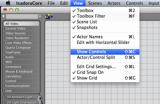 To get started, there are few different ways to reveal the control panel. You can: select it from the drop down menu use Command-Shift-C to see only the control panel or use Control-Shift-S to see a split of the control panel and the programming space. If you've turned on the Grid for your programming space you'll be able to see a distinct difference between the control panel space (on the left) and the programming space (on the right). You'll also notice that with your Control panel active your actor selection bins have been replaced by control panel operators.
As you create new scenes, Isadora will start by connecting all scenes to the same control panel. There are a few different schools of thoughts in terms of best practice in the use of control panels. Using a single control panel for every scene means only building a single interface. As long as you’re only dealing with a limited number of simple cues this is a fine direction to head, and may be the easiest method in terms of programming. This approach can, however, get complicated very quickly if you’re triggering more than one actor per scene. In this scenario the programmer could loose track of where a button or slider is connected. This might cause unexpected playback results or could just be a source of headaches. For more complicated play-back situations, you may instead elect to have separate control panels for each scene. Depending on your programming needs this may be the best way to ensure that your controls are only linked to a single scene.

To accomplish this, you’ll need to split your control panel. Isadora gives you several visual cues to determine how a scene and control panel are linked. When you glance at your scene list you’ll notice that the bar underneath is either continuous (a single control panel) or broken (a split control panel).

To split the control panel click between the two scenes that you wish you separate. When you see your cursor separating the two scenes right click to get a contextual menu with the option to split the control panel. You should now see that the line between the two scenes is now broken.

Let's start by looking at a simple slider. To add a slider to your control panel start by double clicking in the control panel work space. Next type in “slider” and select it when it appears in the drop down menu.
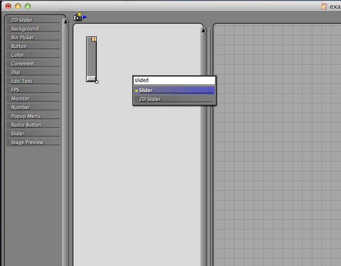
It’s important to note that there is a difference between the 2D slider, and the regular slider. For now, we just want the “slider” control. We can learn a little more about what our slider is doing by double clicking on it.

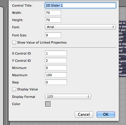
You should see a pop up window with lots of information about our slider:
- Control Title - what this control is named
- Width - how wide is this control (in pixels)
- Height - how tall is this control (in pixels)
- Font - what’s the font used for this control
- Font Size - self explanatory
- Show Value of Linked Properties - this allows data from the patch itself to feed back into the control panel.
As a note, for this to work properly, you’ll also need to enable the “Display Value” check-box(a big thank you to Matthew Haber for catching my error here) - Control ID - the numerical identification number of this control
- Minimum - Slider’s work on a principal that at the bottom, or left, position this control switch will send the number that’s indicated in this box.
- Maximum - Slider’s work on a principal that at the top, or right, position this control switch will send the number that’s indicated in this box.
- Step - The counting increments for this control.
- Display Value - Shows the current value being sent in the control panel itself.
- Display Format - The number of floating points displayed.
- Color - The color of the inside of the slider.
Let’s start by working with the default values for the slider and to see how this is communicating with the patch itself.
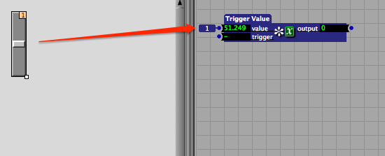
First, we will add a trigger value to the programming space so we can see how values are transferred from the control panel to the programming environment.

Next we can connect the Control ID from the control panel to the Value inlet not he Trigger Value Actor. We can do this by clicking on the Control ID, and dragging the red line to the “value” input.

You should now see a number next to the value input that corresponds to the slider’s control ID.

As we’re working on the control panel our edit mode is currently enabled which will prevent us from being able to actually move the slider with the mouse. To check the controls we have two options:
- We can disable edit mode by right clicking on the control panel work space and selecting “Disable Edit Mode” from the contextual menu.
- We can use the option key to by-pass the above process.
If you’re doing some extensive testing of your control panel I’d recommend that you disable edit mode. On the other hand, if you’re only testing a single slider or button, I’d recommend using the option key as a much more efficient alternative.
Holding down the option key, you should now be able to move the slider in the control panel. You’ll notice that the value linked to the slider also changes.
You’ll also notice that the output from the trigger value has not changed. This is because we’re only adjusting the value, but not activating the trigger. Let’s activate the trigger at the same time we’re moving the slider.
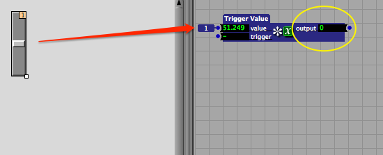
To do this we attach the Control ID to the trigger inlet on the Trigger Value Actor. This will ensure that the actor triggers at the same time that the value is changed. Now when we move the the slider we can see that the output value also changes.

Now that we know how to send slider data to a trigger value we can now look at something a little more interesting. We are going to start by adding a shape actor and connecting that to a projector actor.
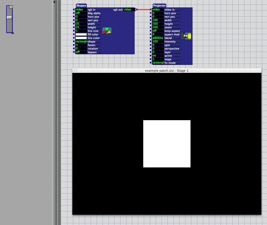
Next connect your vertical slider to the “vert pos” (Vertical Position) inlet on the shapes actor.
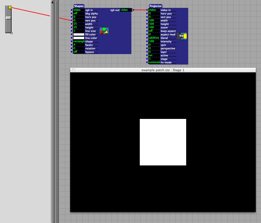
Create a new slider in the control panel. Grab the small box on the bottom right corner and drag the slider to the right until you have created a horizontal slider.

Connect your horizontal slider to the “hora pos” (Horizontal Position) inlet on the shapes actor.

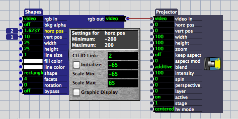
Next we need to adjust the scaling values of the shape actor. Actor’s inlets and outlets can often be scaled to a set range. In order to properly use our slider we’ll need to adjust the inlet scaled values on the Shapes Actor. To do this click on the name of the attribute whose scaled values you’d like to adjust. Start by clicking on “hora pos.” We can see in the pop-up menu that the minimum value is currently set to −200, and the maximum value is set to 200. These values are too high.

Isadora uses a coordinate system that assumes that the middle of the stage is the origin 0,0. Further, Isadora thinks in terms of percentages rather than pixels. In the case of our horizontal slider, a positive value of 50 represents half of the total stage length which puts us at the right most edge of the stage. In the case of shapes it’s also important to note that the shape’s position is relative to it’s center. A positive value of 50 still leaves half of our shape on the screen, no matter the dimensions of the shape.
Set the scaled values of the horizontal position to −65 and 65. Now when we drag our slider (remember to hold down the option key) we are able to move our box from all the way off the stage on the left to all the way off the stage on the right.
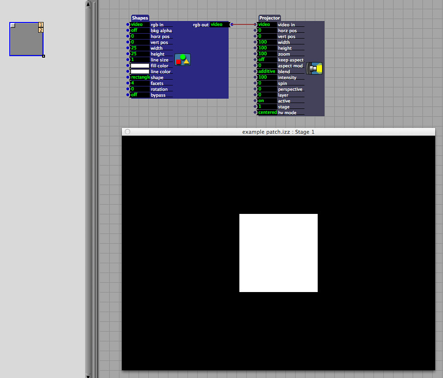
Another type of slider that might be self in this type of situation is the 2D slider. Create a new scene and split the control panel so we can see how this input control works. In the new scene add a Shapes Actor and a Projector Actor, and connect them. Now open add a 2D slider to the control panel.
Double click on the 2D slider so you can see a little more about how this particular control input works. Similar to the “slider” control you can see that you can title the slider, adjust the width, height, font, and so on. You’ll notice that there’s a X Control ID and a Y Control ID.
Next we’ll click okay, and link Control ID 1 (the X control) to the “horz pos” inlet on the Shapes Actor. Now link the Control ID 2 (the Y control) to the “vert pos” inlet on the Shapes Actor. Check to make sure that the horizontal and vertical inlets on the Shapes Actor are properly scaled (last time we set them to −65 and 65).

Now the single 2D slider behaves in the same way as the two sliders we set-up in the exercise above.
This, obviously, is only the beginning of how to work with Sliders and 2D Sliders. You might use a slider to control the playback position of a movie, or the position of a movie on the stage. You might use a slider to control position, zoom, rotation, width, height, really just about any kind of numerical attribute for an actor. The key things to keep in mind in this process are:
- Knowing the range of values that your slider is transmitting
- Knowing the scaled range of values that your actor is transposing values to
- Knowing control ID
- Knowing how to connect your control panel items to Actors in your patch